|
Janet
Jackson
Lighting
Design and Direction
1993 - 1994 "Janet" World Tour
|
In the same sense
that her brother, Michael's tour is every
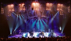
lightingdesigner's dream, so was this show. John McGraw
answered Janet's request for a ______ influenced design,
and came up with a most bizarre and original concept,
utilizing video cubes that hanged at odd angles overhead.
Coupled with that, Janet and her partner/show director,
Renee Elizondo, were totally open to creating a large,
saturated look that was devoid of any sense of symmetry.
This was a true joy to experiment with. All ideas of
conventionality were thrown out, and I was allowed to do
what I love best --- add lights for specific applications
and angles, instead of being held to economics where each
automated light should have at least three primary uses.
Programming was
intense ---- going on for at least 2 months. Each song
was loaded with rhythmic accents and cues. As with the
choreography, we were intent on catching every single one
of them! The end result was a array of lighting cues that
mirrored every move of Janet and the dancers, and every
accent in the music. I compliment my programmers by
mentioning the detailed accuracy of all of the cues.
Janet's show never
slowed ---- even the ballads were loaded with emotion and
movement. It was 2 hours of intensity. What fun! As for
Janet --- she is the most congenial, polite, and caring
performer I have had the pleasure of working with in a
long time.
|